Installation
Style link
copy and paste this link tag inside head tag of you html file.
Icon's link
I have used some of font awesome icons, use this script tag inside head tag of your html file.
If you want to use different icons you can search them in Font-awesome.
Alert
Alerts are used to display important message to the user's whether its Warning, Success, Error or just a simple notification.
Example
To use this alerts use class name as alert followed by alert variant name (e.g:class="alert alert-sucess")
Avatar
Avatar is used display profile picture which show's the identity of the user's, They usually displayed in round shape.
Examples
Avatar with images:
Some avatars have their images, So to use this avatar use class name as avatar followed by avatar-size name (e.g: class="avatar avatar-large"). Also in img tag use class name as img-avatar
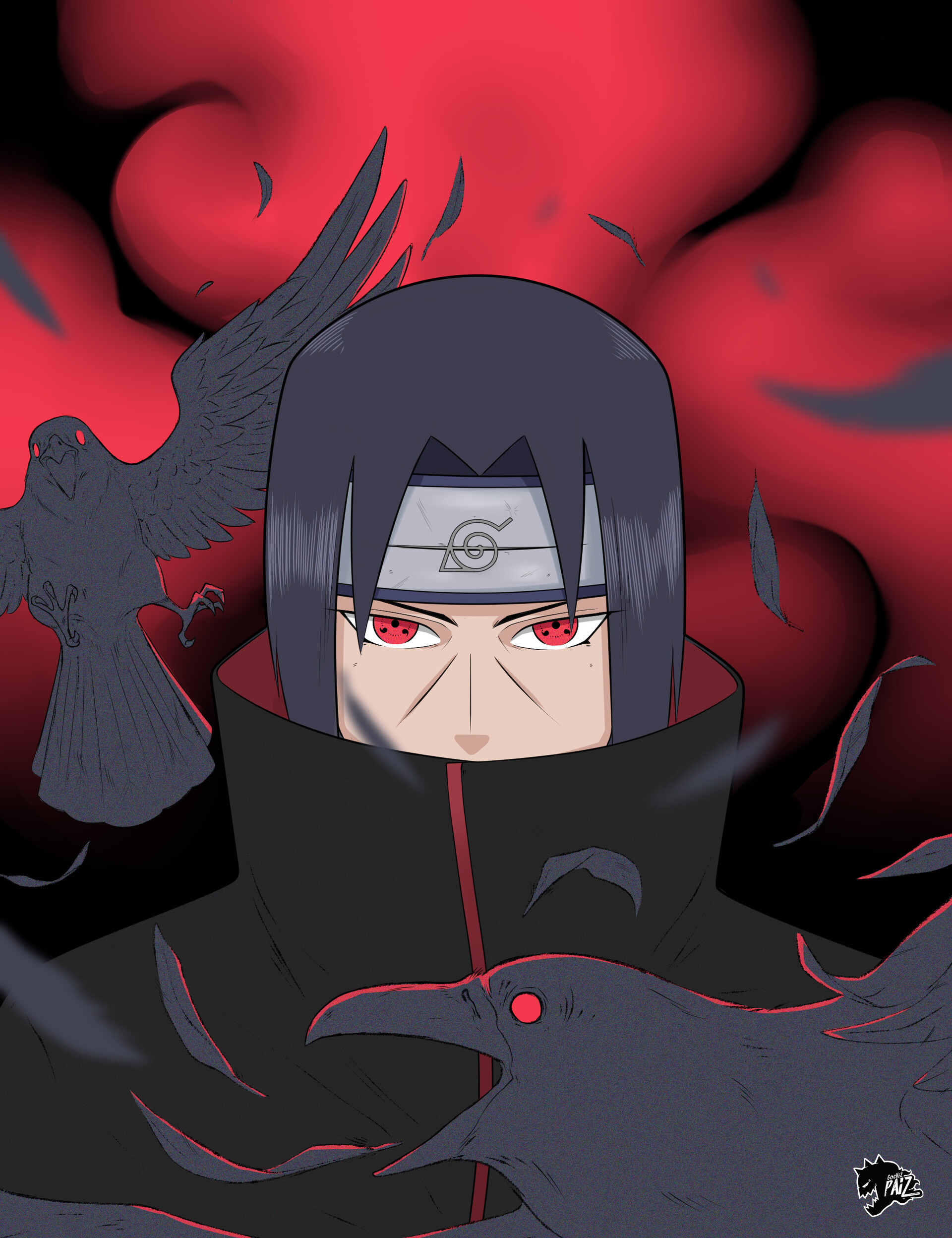
Avatar with Text:
Some avatars only have letter text according to the user name, So to use this avatar use class name as avatar followed by avatar-size name (e.g: class="avatar-large") followed by avatar-text. For e.g(class="avatar avatar-large avatar-text").
Square avatar:
To use this square avatar for avatar image variant add class name as img-avatar-square to img tag, And for the avatar text variant add class name as avatar-square to div tag of avatar.
Badges
Badges are the small cirles which displays number or online/offline status on avatar, icons, buttons. they can places at top/bottom - right or top/bottom - left.
Example
Badges on buttons:
To use badges on buttons place button and div for badge inside a div of class badge-container and for the badge div use class name badge followed by badge-size for e.g(badge-small) followed by badge-position for e.g(badge-right).
To implement hide button functionality use class name badge-h instead of badge in button tag, And then use javascript code paste it in your javascript file which is linked to your html file.
JS code:
Badges on icons:
To use badges on icons place icon and div for badge inside a div of class badge-container and for the badge div use class name badge followed by badge-size for e.g(badge-large) followed by badge-position for e.g(badge-right).
Badges on avatar:
Badges on avatar usually use to show online/offline, to use this variant of badge on avatar place avatar image tag and div for badge inside a div of class avatar-img-badge-container and for the badge div use class name badge followed by badge-size for e.g(badge-large), followed by badge-position for e.g(badge-bottom, followed by badge-border ,followed by badge-online/offline for e.g(badge-offline).
Also use class name avatar and avatar-large inside img tag.
Cards
Cards are used to display simple details and action of single item or topic.
Example
Standard Text card:
For card with a shadow use class name card-shadow.
Our Changing Planet
by Khan
Visit ten places on our planet that are undergoing the biggest changes today.
Our Changing Planet
by Khan
Visit ten places on our planet that are undergoing the biggest changes today.
Standard card with image:
For card with image on top.

Our Changing Planet
by Khan
Visit ten places on our planet that are undergoing the biggest changes today.
Horizontal Card:
Our Changing Planet
by Khan
Cards with text overlay:
Our Changing Planet
by Khan
Visit ten places on our planet that are undergoing the biggest changes today.
Gird:
Grid-Auto
Using grid-auto class the grid items will get fit into the CURRENTLY AVAILABLE columns space by expanding them so that they take up any available space.
In the below component we have used gird-column size of minimum of 250px and maxmimum of 1fr and auto-flow of row which is default.
Grid with 2 items
Grid with 3 items
Images
Example
Responsive images are something which displays image within its parent container.
To use this add class name of img-responsive.
Images with 200px X 200px Size.
To use square images use class nameimg-square, for round image use class nameimg-round.
Input
Inputs are used to take a data from the user's.
Use class name form in form tag, for label tag use class name input-label, for input tag use class name input, to show the error text use class name error-msg.
Example:
Lists
List are used to display the series of content.
List could be in stacked or in row.
stacked-list:
- Naruto
- Kakashi
- Itachi
- Shikamaru
- Hashirama
Characters
List in row:
- Naruto
- Kakashi
- Itachi
- Shikamaru
- Hashirama
Characters
Modal
Modal are used to display popup message for the user just like browser alert or prompt.
modal Header
Lorem ipsum dolor sit amet.
JS code:
Snackbar
Snackbar is used to show message or feedback to the user, Snackbar usually displayed for 2 or 3 seconds.
Here we have three variants of snackbar's. Use these class names snackbar-error, snackbar-success, snackbar-message.
Slider
Sliders are used to choose a value within a range.
value-slider
icon-slider
Text-Utilities
To use text align:
This text will be at center.
This text will be at left.
This text will be at right.
To use text decoration:
To use text transform:
This is upper text.
This is lower text.
This is text with capitalize.
To use line height:
Lorem ipsum, dolor sit amet consectetur adipisicing elit. Similique quisquam sit, aut dolor tenetur nihil, dolore sed laboriosam nemo enim animi commodi ex? Amet eius ad autem ab atque? Velit?Lorem ipsum dolor, sit amet consectetur adipisicing elit. Laudantium, dolor voluptates autem praesentium cupiditate distinctio sed, nisi aliquam velit corrupti, qui illum ipsa? Impedit architecto officia maiores expedita. Voluptatem neque accusamus laudantium reprehenderit at deleniti fuga ex consequuntur alias quisquam!
Lorem ipsum, dolor sit amet consectetur adipisicing elit. Similique quisquam sit, aut dolor tenetur nihil, dolore sed laboriosam nemo enim animi commodi ex? Amet eius ad autem ab atque? Velit?Lorem ipsum dolor, sit amet consectetur adipisicing elit. Laudantium, dolor voluptates autem praesentium cupiditate distinctio sed, nisi aliquam velit corrupti, qui illum ipsa? Impedit architecto officia maiores expedita. Voluptatem neque accusamus laudantium reprehenderit at deleniti fuga ex consequuntur alias quisquam!
Lorem ipsum, dolor sit amet consectetur adipisicing elit. Similique quisquam sit, aut dolor tenetur nihil, dolore sed laboriosam nemo enim animi commodi ex? Amet eius ad autem ab atque? Velit?Lorem ipsum dolor, sit amet consectetur adipisicing elit. Laudantium, dolor voluptates autem praesentium cupiditate distinctio sed, nisi aliquam velit corrupti, qui illum ipsa? Impedit architecto officia maiores expedita. Voluptatem neque accusamus laudantium reprehenderit at deleniti fuga ex consequuntur alias quisquam!